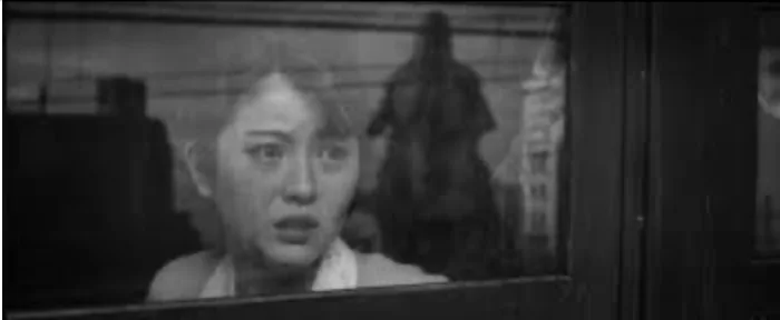
"Godzilla Minus One" was already one of the best Godzilla movies, for the way it used the kaiju movie template to tell a story that was essentially a sweeping melodrama about surviving wars and other catastrophes. The announcement that it was going to be released in a black-and-white version was tantalizing, and the result is a thing of beauty.
Written and directed by Takashi Yamazaki, who also oversaw the Oscar-winning special effects (one of the great recent examples of doing more with less; the movie's budget was a fraction of Hollywood blockbuster norms), it was one of a handful of giant monster movies that insisted that its human story was the true center of the experience and made you feel by the end that it had made good on its promise.
The monochrome version, which recently played in American theaters and is now available for home viewing, only amplifies the sense that the humans are being tormented by what is essentially a gigantic metaphor for chaos, a continuation of war and perhaps a manifestation of karmic punishment for having taken part in a war, individually and a society, and perhaps for a lot of other things as well, including personal failings of the characters, some discussed, others left to be inferred. Perhaps unexpectedly, the movie I kept thinking of was Martin Scorsese's remake of "Cape Fear," in which a defense attorney who suppressed evidence that might have allowed a vicious criminal to go free is tormented by that same criminal after he gets released from prison, for having violated his oath as a lawyer. The criminal is nearly demonic in his relentlessness and seeming invulnerability, which makes it seem as if the lawyer and his family are being pursued by a demon, or by their own demons.
Various filmmakers and film scholars have spoken over the decades about how black-and-white and color affect the viewer's brains differently. One such quote that resonates is from Russian filmmaker Andrei Tarkovsky ("Solaris," "Stalker"). In real life, he said, "we don't notice color. A black-and-white film immediately creates the impression that your attention is concentrated on what is most important. On the screen color imposes itself on you, whereas in real life that only happens at odd moments, so it's not right for the audience to be constantly aware of color. Isolated details can be in color if that is what corresponds to the state of the character on the screen. In real life the line that separates unawareness of color from the moment when you start to notice it is quite imperceptible. Our unbroken, evenly paced flow of attention will suddenly be concentrated on some specific detail. A similar effect is achieved in a film when colored shots are inserted into black-and-white."
Tarkovsky continues: "Color film as a concept uses the aesthetic principles of painting, or color photography....it becomes a moving painting. It's all too beautiful, and unlike life. What you see in cinema is a coloured, painted plane, a composition on a plane. In a black-and-white film there is no feeling of something extraneous going on, the audience can watch the film without being distracted from the action by colour." (Thanks to author Sarah Welch-Larson for helping me locate this quote!) Other accomplished directors have said similar things, including Orson Welles, who didn't make his first color film until the 1970s. Peter Bogdanovich, Welles' friend and booster, quoted him when explaining why he made the 1940s period piece "The Last Picture Show" in black-and-white in 1971, at a time when very few black-and-white films were being released. "Orson Welles says every performance looks better in black and white. You focus on the performance, not the look of the people. And it enables you to capture the period better."
Black-and-white cinematography has been mostly out-of-favor for over sixty years, despite well-regarded outliers like "Raging Bull," "Schindler's List," "Ed Wood," "The Lighthouse," "The Tragedy of Macbeth" and a small number of others. But buffs appreciate how the absence of color re-orients the brain, erases a lot of complaints about lack of plausibility or realism, and helps viewers accept what's happening on its own, more figurative terms. And there have been a few high-profile features in the last 20 years that released black-and-white versions, including "The Mist," "Logan" and "Mad Max Fury Road." I prefer the black-and-white versions of all of these movies because they have that clarifying, focusing effect that Tarkovsky spoke of. You see, for lack of a better phrase, the thing itself, the film as an object. Color is, of course, its own marvelous thing, and a joy to behold when proper attention is paid to color theory. But there's something to be said for sweeping away the extraneous, and monochrome helps with that.
"Godzilla Minus One Minus Color" employs visual effects technology that filmmakers from the heyday of black-and-white could never have envisioned, and some of the visual language is more modern than classical (especially the use of a "handheld" camera to follow some of the monster action). But for the most part, the movie has been composed and directed in a manner that pays tribute to black-and-white films from the 1960s that used the very wide, CinemaScope format, like Tarkovsky's "Andre Rublev" and Akira Kurosawa's great run of monochrome 'Scope movies (including "High and Low" and "Yojimbo"). The images use frames-within-frames and dynamic, converging lines to guide the eye around within the image. You might've noticed and admired this in color, and you might still do so in black-and-white, but I felt as if the effect of these techniques was felt more intuitively while watching the film without color. I wasn't admiring a beautiful object. I was actually in it.
Also noteworthy is the wide range of the grey scale and the rich, at times almost tactile-seeming quality of the light. They obviously didn't just take the color out here. They've gone to great lengths to approximate the feeling of watching a movie that was designed to be seen this way. It's a great experience, highly recommended not just to Godzilla fans but to anybody who appreciates beauty and craft.
